This project is set in the context of a fictitious large-scale e-commerce platform, whose performance depends heavily on its conversion rates. The company is looking to optimize user journeys at critical business moments, particularly during checkout.
Company
DRVL Group
Period
—
2024
Role
UI / UX Designer & Developer
Project overview
This project is an in-depth study of the user experience of an e-commerce checkout, focused on one of the most critical moments in the customer journey: payment. It is set in the context of a fictional e-commerce platform whose performance depends directly on its conversion rates and the smoothness of its purchasing journey.
The project aims to analyze and redesign the checkout in order to reduce friction, limit cart abandonment, and improve the overall experience, especially on mobile. The approach taken consists of viewing the checkout not as a simple sequence of technical steps, but as a full-fledged user experience, requiring clarity, reassurance, and efficiency.
This project focuses on optimizing the UX of a critical business moment by incorporating considerations related to progression, error handling, intermediate states, and reducing the user's cognitive effort.
Défis
The main challenge was reducing cart abandonment while maintaining a secure and reassuring user journey. It was also necessary to design a truly mobile-first experience, capable of handling errors, loading times, and less-than-ideal cases without causing frustration. State management and the clarity of messages played a central role in the success of the project.
Goals
Reduce cart abandonment
Simplify the checkout process
Optimize the mobile experience
Approach & Key Decisions
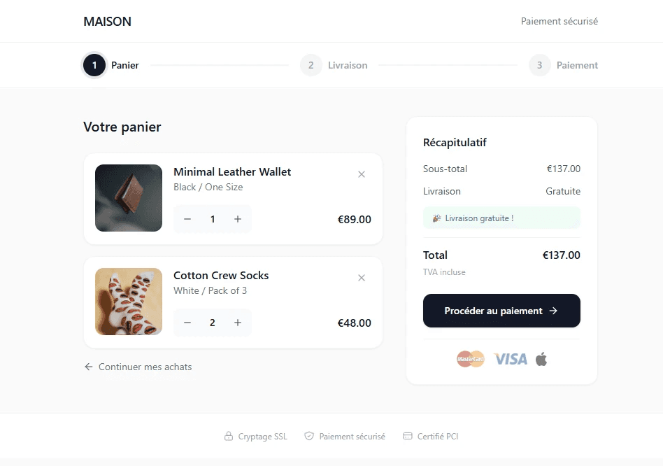
The checkout was structured as a progressive flow limited to four steps, with guest checkout by default. Error and loading states were treated as key elements of the experience, with clear and reassuring messages.


Results & Learning
The project results in a shorter, clearer payment journey that is better suited to mobile use. Each step of the checkout is clearly identified, friction points are reduced, and critical states, such as errors or loading, are treated as central elements of the experience.
This work illustrates my ability to intervene in high-impact business moments, by designing UX experiences focused on conversion, reassurance, and performance, while taking into account the real constraints of an e-commerce environment.
Other projects


This project is set in the context of a fictitious large-scale e-commerce platform, whose performance depends heavily on its conversion rates. The company is looking to optimize user journeys at critical business moments, particularly during checkout.
Company
DRVL Group
Period
—
2024
Role
UI / UX Designer & Developer
Project overview
This project is an in-depth study of the user experience of an e-commerce checkout, focused on one of the most critical moments in the customer journey: payment. It is set in the context of a fictional e-commerce platform whose performance depends directly on its conversion rates and the smoothness of its purchasing journey.
The project aims to analyze and redesign the checkout in order to reduce friction, limit cart abandonment, and improve the overall experience, especially on mobile. The approach taken consists of viewing the checkout not as a simple sequence of technical steps, but as a full-fledged user experience, requiring clarity, reassurance, and efficiency.
This project focuses on optimizing the UX of a critical business moment by incorporating considerations related to progression, error handling, intermediate states, and reducing the user's cognitive effort.
Défis
The main challenge was reducing cart abandonment while maintaining a secure and reassuring user journey. It was also necessary to design a truly mobile-first experience, capable of handling errors, loading times, and less-than-ideal cases without causing frustration. State management and the clarity of messages played a central role in the success of the project.
Goals
Reduce cart abandonment
Simplify the checkout process
Optimize the mobile experience
Approach & Key Decisions
The checkout was structured as a progressive flow limited to four steps, with guest checkout by default. Error and loading states were treated as key elements of the experience, with clear and reassuring messages.
Results & Learning
The project results in a shorter, clearer payment journey that is better suited to mobile use. Each step of the checkout is clearly identified, friction points are reduced, and critical states, such as errors or loading, are treated as central elements of the experience.
This work illustrates my ability to intervene in high-impact business moments, by designing UX experiences focused on conversion, reassurance, and performance, while taking into account the real constraints of an e-commerce environment.