EKOZ is a visual identity project designed as part of a Bachelor's degree workshop in Graphic Design, simulating a real client brief. The brief consisted of creating a label for experimental music from just four audio tracks. The challenge was to translate an abstract and sensory sound universe into a coherent, strong graphic identity that could be adapted to both physical and digital supports.
Company
EKOZ
Period
—
2023
Role
Brand Designer

Project overview
The project is based on the creation of a global visual universe for a fictional label, conceived as an artistic project in its own right. Each musical track is treated as if it had been produced by a different artist, while being brought together under a common project: KROMATIK PROJEKT.
The identity needed to function as a graphic system capable of adapting to different media while maintaining a strong coherence, translating the notions of rhythm, echo, repetition, and movement inherent to experimental music.
Défis
The main challenge lay in the abstraction of the subject: translating sound and emotional sensations into readable and impactful visual elements.
The project also imposed strong constraints in terms of time and resources, necessitating precise and effective graphic choices. Finally, it was necessary to ensure overall coherence among very diverse media, while maintaining a recognizable and singular identity.
Goals
The main objective was to design a complete and coherent visual identity, capable of representing an experimental music label over the long term.
The project also aimed to demonstrate the ability to translate a sound universe into visual language, to structure a multi-support graphic system, and to maintain a strong artistic direction despite constraints of time and resources.
Approach & Key Decisions
The identity revolves around the logotype EKOZ, constructed as a direct reference to echoes and sound resonances. Each letter corresponds to a fictional artist collaborating on the project:
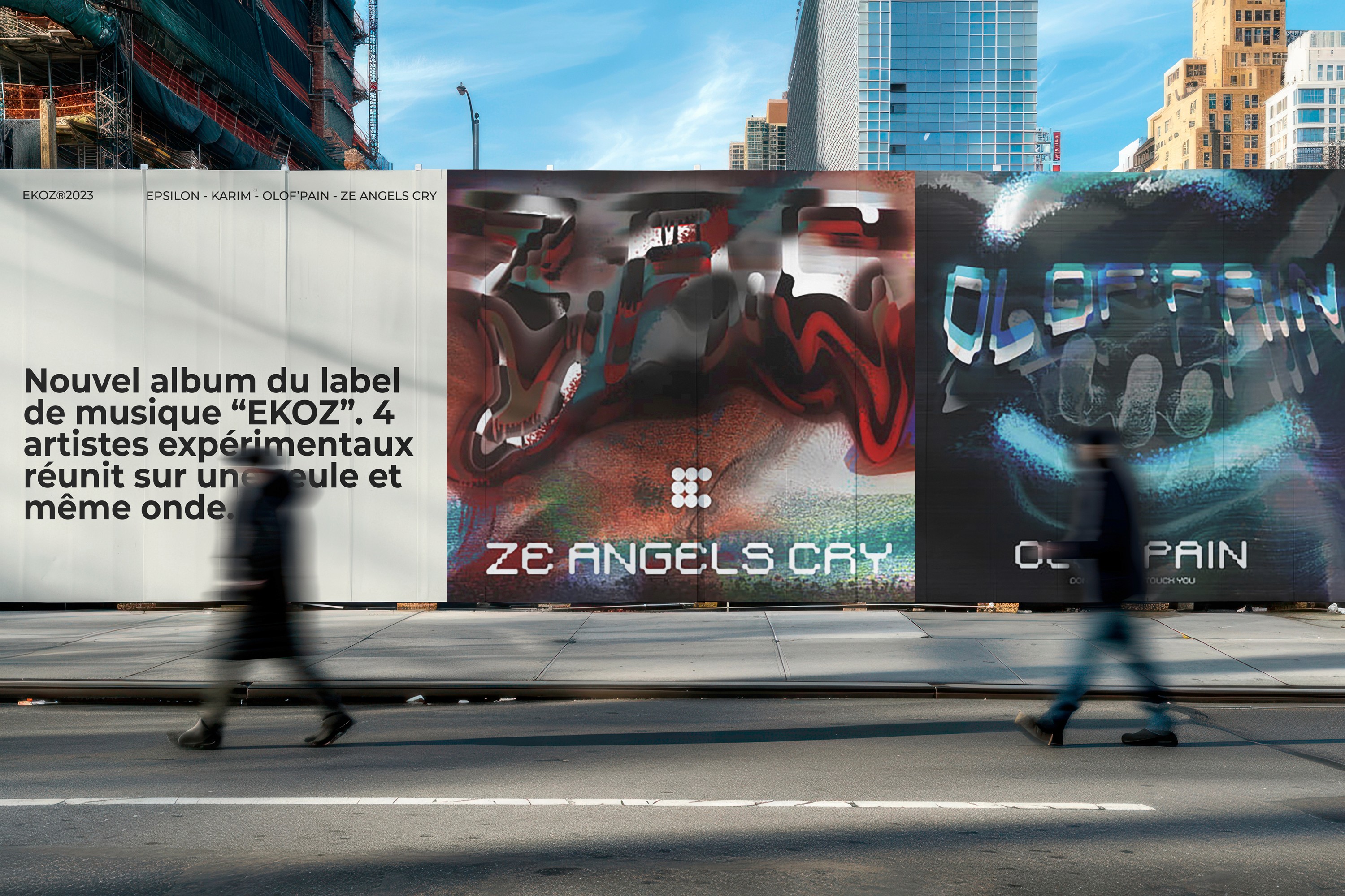
E for Epsilon, K for Karim, O for Olof’Pain, Z for Ze.Angels.Cry.
The graphic universe adopts a dark, raw, and glitched aesthetic, evoking the experimental dimension of the music. The visual system has been adapted across numerous mediums: posters, vinyl covers and CDs, merchandising, packaging, and digital supports.


Results & Learning
EKOZ results in a complete, coherent, and highly expressive visual identity, capable of existing across different media while maintaining a clear graphic signature.
The project demonstrates my ability to design a global visual universe, to work on multi-media coherence, and to translate abstract concepts into concrete graphic solutions. This experience has reinforced my mastery of art direction, visual storytelling, and the design of sustainable graphic systems.
Other projects


EKOZ is a visual identity project designed as part of a Bachelor's degree workshop in Graphic Design, simulating a real client brief. The brief consisted of creating a label for experimental music from just four audio tracks. The challenge was to translate an abstract and sensory sound universe into a coherent, strong graphic identity that could be adapted to both physical and digital supports.
Company
EKOZ
Period
—
2023
Role
Brand Designer
Project overview
The project is based on the creation of a global visual universe for a fictional label, conceived as an artistic project in its own right. Each musical track is treated as if it had been produced by a different artist, while being brought together under a common project: KROMATIK PROJEKT.
The identity needed to function as a graphic system capable of adapting to different media while maintaining a strong coherence, translating the notions of rhythm, echo, repetition, and movement inherent to experimental music.
Défis
The main challenge lay in the abstraction of the subject: translating sound and emotional sensations into readable and impactful visual elements.
The project also imposed strong constraints in terms of time and resources, necessitating precise and effective graphic choices. Finally, it was necessary to ensure overall coherence among very diverse media, while maintaining a recognizable and singular identity.
Goals
The main objective was to design a complete and coherent visual identity, capable of representing an experimental music label over the long term.
The project also aimed to demonstrate the ability to translate a sound universe into visual language, to structure a multi-support graphic system, and to maintain a strong artistic direction despite constraints of time and resources.
Approach & Key Decisions
The identity revolves around the logotype EKOZ, constructed as a direct reference to echoes and sound resonances. Each letter corresponds to a fictional artist collaborating on the project:
E for Epsilon, K for Karim, O for Olof’Pain, Z for Ze.Angels.Cry.
The graphic universe adopts a dark, raw, and glitched aesthetic, evoking the experimental dimension of the music. The visual system has been adapted across numerous mediums: posters, vinyl covers and CDs, merchandising, packaging, and digital supports.
Results & Learning
EKOZ results in a complete, coherent, and highly expressive visual identity, capable of existing across different media while maintaining a clear graphic signature.
The project demonstrates my ability to design a global visual universe, to work on multi-media coherence, and to translate abstract concepts into concrete graphic solutions. This experience has reinforced my mastery of art direction, visual storytelling, and the design of sustainable graphic systems.